Comparing the new FCC maps to the 2020 Census
The base layer for the new FCC broadband maps is a “Fabric” of serviceable locations on top of which ISP service data is overlaid. The process is so new that everyone involved has been going to great lengths to lower expectations. I’ve long planned to use the 2020 Census as a source of “ground truth” for the new maps. That analysis is now possible. While there are some caveats, in America’s least dense 2,148 counties, there are 25.5 million Broadband Serviceable Locations compared to 24.5 million housing units according to the 2020 Census. This preliminary analysis should give comfort through the challenge process that rural America is not being wholesale underrepresented in the new maps.
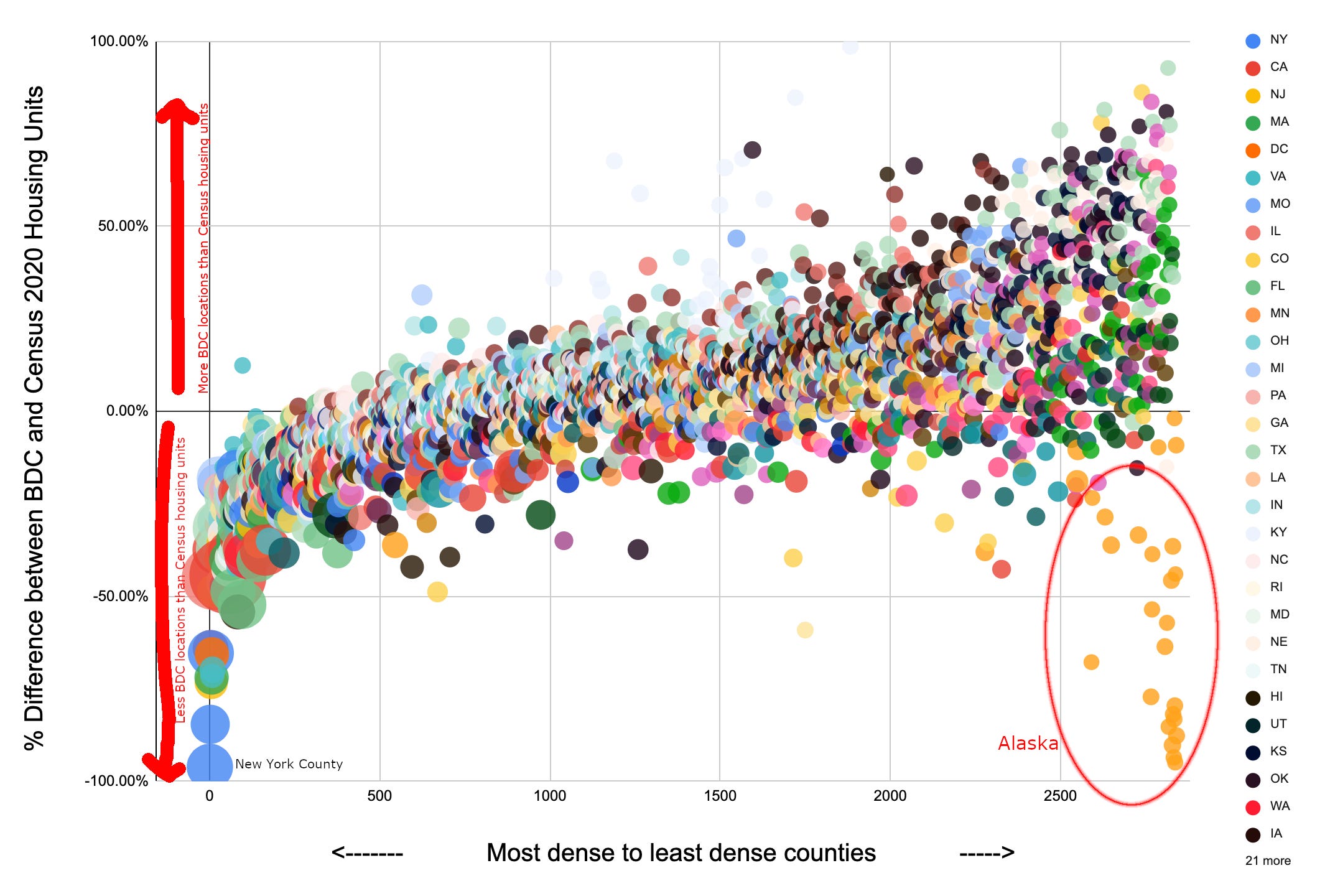
One of the narratives that has emerged as people click through the FCC’s map is that there are a lot of missing rural, presumably unserved, locations. At the aggregate level, that doesn’t appear to be the case. Less dense counties generally have more BDC locations than Census housing units.
Here’s how to read this chart: New York County (Manhattan) is the nation’s most dense county so it’s the left-most county on the chart. In the broadband Fabric, an apartment building is one serviceable location regardless of how many housing units it contains. Thus, in dense counties — with lots of apartment buildings — we expect the number of BSLs to be lower than the number of housing units. In Manhattan there are 36,000 BSLs and 914,000 housing units — 96% fewer BSLs than housing units. That’s ok. It’s a known limitation/aspect of the data.
As we move right in the chart the counties are getting less dense. In less dense counties, we expect less apartment buildings, and we’d hope that the number of BSLs and housing units are closer together — closer to 0% difference between the two. (Business that might subscribe to mass market services could also be BSLs, but would not be housing units).
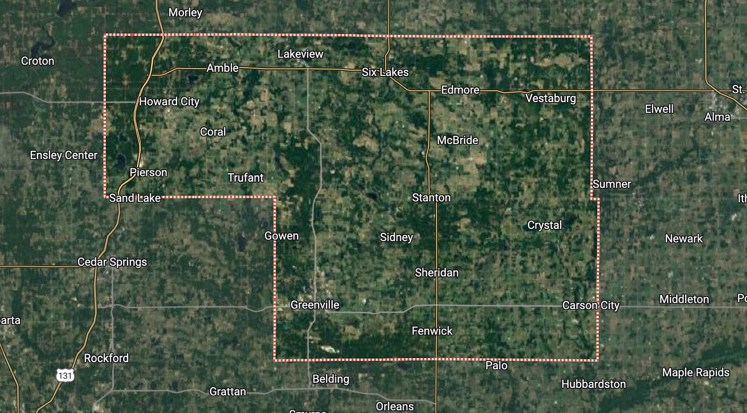
The 1,000th most dense county in the country is Montcalm County, Michigan. In this county there are 30,339 BSLs and 27,894 residential housing units. While it is possible there are non-residential businesses that are bringing up the BSL count, or a handful of apartment buildings, it’s also possible there are BSLs such as barns or other buildings that maybe shouldn’t be included. With 9% more BSLs than housing units in a county that is almost certainly residential, it’d be a tough argument that this county is underrepresented in terms of total BSLs.
I think this data should provide peace of mind that regardless of what happens in the challenge process, rural America as a whole is fairly represented by BSLs. There are some outliers - counties with fewer BSLs than housing units (on the lower side of the chart) and counties with higher numbers of BSLs than housing units (on the high side of the chart). Those would need to be looked at individually so see if there is a county-specific reason for the deviation from the average.
Alaska is a particular concern. They have some of the least dense counties in the country (lower right of the chart). The Census says there are 1,469 housing units in Lake and Peninsula Borough, Alaska. There are only 75 BSLs according to the Fabric. Alaska clearly saw this issue because they raised it with NTIA and FCC officials in August.
The biggest caveat with this analysis is it isn’t strictly apples-to-apples. As discussed, one apartment building with 25 units is one BSL but 25 housing units in the Census. Also, businesses could be BSLs if they might subscribe to mass-market broadband. Both these pieces of data (residential/commercial code, and a housing unit count) exist on the Fabric data but were not included in the release of data. I’ve asked the FCC to consider releasing a location file that includes those data points. If they are able to do that I’ll be able to update this analysis to make it more apples-to-apples on residential housing units.
On an adjacent topic, I’ve added a sheet to the spreadsheet that has the BDC counts and a projected BEAD allocation. In this version, we can put in assumptions about the net additions to the unserved BSL count for a given state and see how it affects the allocations nationally.
For example, it has been widely reported that NY filed challenges to add 31,500 BSLs to the Fabric. Assuming 15,000 of those locations are included in the Fabric as unserved (that is not a data-based assumption, just a wild guess), and no other state issued successful challenges, New York’s allocation would go up by $62 million, or $4,154 per new unserved BSL added by challenge.
Unfortunately, New York’s gain would be others’ loss. Texas would lose $6 million. Virginia, Pennsylvania, North Carolina, Missouri, Mississippi, Michigan, Louisiana, Kentucky, Georgia, Florida, California, Arkansas, and Alabama would all lose more than $2 million. (Assuming of course they didn’t have any net adds through the challenge process themselves.)


Thanks so much for these posts, Mike. They're incredibly helpful as we digest the new maps and the challenge process. We've been using the workbook you created to build models to help us evaluate what the addition of unserved BSLs would mean for Maine and what kind of challenge strategy we'll need to roll out to achieve those goals.
The (multi) million dollar question seems to be: What is the national average of proportional unserved BSL additions that we need to stay ahead of to ensure that we can increase (or at the very least, maintain) our BEAD allocation? In your eyes, is this the right question to be asking?