An analysis of RDOF Phase 1
The FCC recently released the results of the first part of the Rural Digital Opportunity Fund auction. As with everything in our politics, and certainly, anything that produces winners and losers, opponents were quick to point out issues.
For background: up to $16 billion was available to broadband providers to bring service to currently unserved areas. Because of the reverse auction format, where providers bid down the subsidy level at which they’re willing to provide service, $9.2 of the $16 billion was committed.
We can talk about problems with the maps (they need work!), how to compare speeds between different providers (need to strive for fairness), and whether individual companies can be trusted to make good on their promises (if a Senator is saying this…ouch). It’s important to also know that the money just doesn’t flow out the door to these companies. They have convince the FCC through a long-form application that they can deliver on their promises, and then report annually on their progress. That hard work starts now.
Taken as a whole, the auction seems to have worked at allocating money to rural areas where it’s needed to connect more people.
Coming into the auction, 2.7% of the eligible locations needing access were urban, 10.5% were suburban, and 86.7% were rural. Put another way, 86.7% of the locations are rural but 91.2% of the funding went to rural areas.
The same dynamic is at work if you look at the number of people that are slated to gain access to broadband under these results. Presumably because it is cheaper for a provider to bring new service into a urban area than a rural area (more ground to dig up in rural areas), and the reverse auction format makes them bid each other down, the subsidy is $202 per new person with access in urban areas, $336 in suburban areas, and $819 in rural areas.
The maps are never going to be perfect, and in fact it will take a long time for them to even get better. Comparing complicated technology is complicated. And of course we need a plan in place to monitor the corporate giants getting this funding. But at least we’ve started.
(updated 12/18/20) While progress is good, there’s also some mess. This was preventable, and now it needs to be cleaned up. The FCC released three lists of eligible areas before bidding started. If any of us (me included) had looked at the list ahead of time, we could have pointed out airports, golf resorts and parking lots and questioned the locations data and eligibility criteria that underpin their inclusion. But we didn’t, so here we are.
The good news is the FCC has a bunch of steps in the process where they can make sure this money is put to good use. The first is the long form application. They must:
1) Provide in their long-form applications additional information about qualifications, funding, and the network that they intend to use to meet their obligations
2) Within a specified number of days, submit a letter from an eligible bank committing to issue a letter of credit; …
3) Within 180 days of being announced as winning bidders, certify they are eligible telecommunications carriers in any areas for which they seek support and submit relevant documentation.
Beyond the long-form application, they also must:
File with USAC annual reports and build-out milestone certifications, as well as data on the locations where service is available. Failure to meet the terms and conditions of support can result in increased reporting obligations and possible withholding and/or recovery of support.
Offer at least one broadband and voice service at rates that are reasonably comparable to the rates for similar service in urban areas. The FCC uses its annual Urban Rate Survey to determine the range of rates that are reasonably comparable.
There is plenty of room for the FCC to exert influence over questionably-funded areas, or questionably-able winners, or even “possible withholding and/or recovery of support”. Where do we need to look more closely? In this post I made some suggestions for where there might be problems in the data. The same thing applies here.
In justifying the RDOF auction with bad maps, FCC Chair Pai said “we know which areas are on the wrong side of the digital divide.” The RDOF eligibility list didn’t reflect that knowledge. However, between the inaccurate FCC data, and the 5-year estimates from the ACS data, we can start to piece together a better picture.
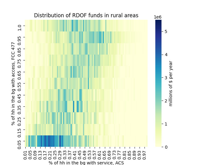
The chart below shows the distribution of RDOF funds in rural areas by both FCC and ACS data. The largest chunks of money are in areas with no access according to FCC, and very little service according to ACS — as it should be. Areas where the FCC shows near 100% access to broadband may still need broadband help because of over-counting, or in these rural areas, the unserved block that made them eligible may not be easily reached. However if the FCC says there is 100% access, and the ACS says there is near 100%…that’s a good place to look.
The numbers in suburban and urban areas are tiny by comparison. There are some areas to look at in suburban areas where both the FCC and ACS think there is existing good access and service. Indeed these are the areas that keep popping up when you browse the FCC map of the awards and find something curious.
It’s good that the FCC is starting to use RDOF money to increase access in rural areas. But the FCC has their work cut out for them to apply all the rules strictly to ensure ISPs deliver on their promises, and don’t walk away with precious digital divide funding without truly improving access.
(Updated 1/13/20) Coming back to this, I looked at what happens if you use the aggregate data to take a couple cuts at these awards. I don’t know if the FCC would need to pass new rules to cut these subsidies, or if it could be done with the long-form application. Either way, here’s a couple ideas:
Looking at blocks with no population is an obvious place to start. If you drop block groups where all of the RDOF-eligible blocks had 0 population in the 2010 census, you’d cut 9,614 block groups and $60 million (0.6%) in support. (The FCC appears to use a model to project to 2019 population, which is not helpful in this instance). Some of these identified block groups with high location counts appear to be commercial areas. The ones with one or two locations seem to be more likely to be medians.
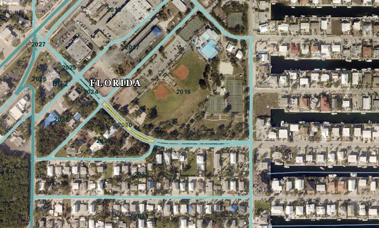
Here’s an example: block group 120879705002 is a residential community in the Florida Keys. Block 120879705002030 is a median and the only eligible block in the group. It obviously had no population in the 2010 census but has a population of 2 in the FCC’s projection of 2019 population. It has 1 eligible location according to the RDOF data. There isn’t much detail on where the location data comes from — I believe it’s a proprietary source. Without seeing the underlying data I can’t be sure, but if I had to guess, there is a issue with the geocoding of the locations data which is putting it in the wrong block.
Another issue is places privately connected to the internet, such as airports, prisons, and military installations, which won’t show up as covered in the Form 477 data but do appear to have locations. If we cut out block groups with both more locations than housing units (according to the 2010 census) and block groups with either 0 or 1 housing units total, we’d cut out 181 block groups representing $3.72 million in funding. In addition to the Pentagon block, it seems to cut out airports and prisons as well.
A broader cut would try to do something about areas that have decent access and service according to FCC and ACS, but were still eligible because of a couple blocks without “access”. These areas are suburban communities, many of which would be able to call the local ISP and get service. If you look at suburban block groups with > 50% service according to ACS and > 85% access according to FCC, you’d cut 15,781 block groups and $300 million in funding. It’s possible this cut is slightly too broad: this block group outside Sacramento is quite rural despite it’s suburban classification. It received $91k in support to serve 161 locations.


